MailChimp’s free plan with up to 2000 subscribers is a big pull for many newbie bloggers. There are other companies that have free plans but MailChimp offers an unparalleled number of features (IMHO). MailChimp’s popup signup form has helped me grow subscribers at a fast pace in all my blogs. But the popup signup form has a few irritants that I hope MailChimp will address someday.
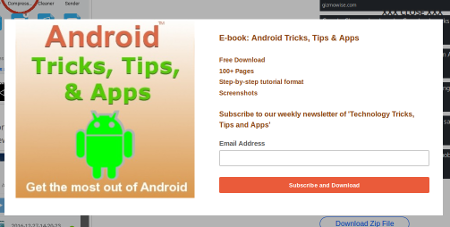
1. Where is the CLOSE button? Look at a popup screenshot below and find the close button.
Let me help you find it if you did not.
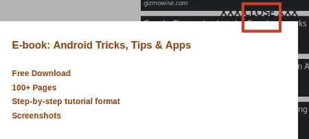
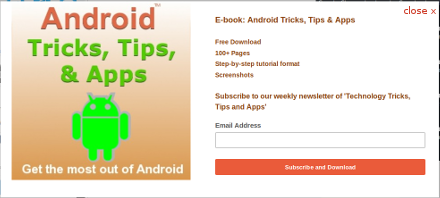
Here the close button is difficult to find because the background color of the page and the close button are of a similar color. As a publisher, I do not always have control over the background color. For example, I have no control over the background color of adsense banners . I cannot ensure that the close button and the adsense banner are always of contrasting colors. Top position in the right side bar is one of the best performing placement for an adsense banner. And that is where MailChimp’s close button appears most of the time. If MailChimp team is listening, I suggest that the close button be placed inside the popup box instead of being outside. Publishers can then ensure that the popup background and the button are of contrasting colors.
2. Popup delay is too small The popup delay offered by MailChimp is only 5 secs. And most expert bloggers suggest that 15 seconds is the ideal delay for a popup. Some even mention 45 secs. In any case, 5 secs is too little and annoying for the visitor. I hope MailChimp addresses this issue soon.
3. Closing popup on a mobile screen is annoying It’s okay to expect a PC user to close the popup using the close button. But it annoys mobile users if they have to scroll to find the close button. My analytics shows that subscriptions from mobile phones are very low, so it makes sense to let mobile users close the popup without clicking on the close button. Some email marketing services allow the popup button to be closed by simply tapping anywhere on the screen outside the popup. MailChimp can look at providing this option.
1. Where is the CLOSE button? Look at a popup screenshot below and find the close button.

Let me help you find it if you did not.

Here the close button is difficult to find because the background color of the page and the close button are of a similar color. As a publisher, I do not always have control over the background color. For example, I have no control over the background color of adsense banners . I cannot ensure that the close button and the adsense banner are always of contrasting colors. Top position in the right side bar is one of the best performing placement for an adsense banner. And that is where MailChimp’s close button appears most of the time. If MailChimp team is listening, I suggest that the close button be placed inside the popup box instead of being outside. Publishers can then ensure that the popup background and the button are of contrasting colors.

2. Popup delay is too small The popup delay offered by MailChimp is only 5 secs. And most expert bloggers suggest that 15 seconds is the ideal delay for a popup. Some even mention 45 secs. In any case, 5 secs is too little and annoying for the visitor. I hope MailChimp addresses this issue soon.
3. Closing popup on a mobile screen is annoying It’s okay to expect a PC user to close the popup using the close button. But it annoys mobile users if they have to scroll to find the close button. My analytics shows that subscriptions from mobile phones are very low, so it makes sense to let mobile users close the popup without clicking on the close button. Some email marketing services allow the popup button to be closed by simply tapping anywhere on the screen outside the popup. MailChimp can look at providing this option.
